Improving User Experience in Catan Online
A personal project born from my love of Catan and my frustration with its current online version. I redesigned the user interface and rethought the main user flows to make the digital experience more intuitive and enjoyable.
What is Catan?
Catan Universe is a board game adapted online on web, steam and mobile platforms. I started playing again during covid on the web browser version. They launched a UI update 2.0 DURING COVID lockdown.
UX ISSUE
1. Invasive Welcome Screen
It’s been quite some time since I wanted to get back to Catan and play a few games.
I’m welcomed on the landing page with an “Important Message” pop-up about Catan tournaments.
Here are the issues I found on this pop-up screen:
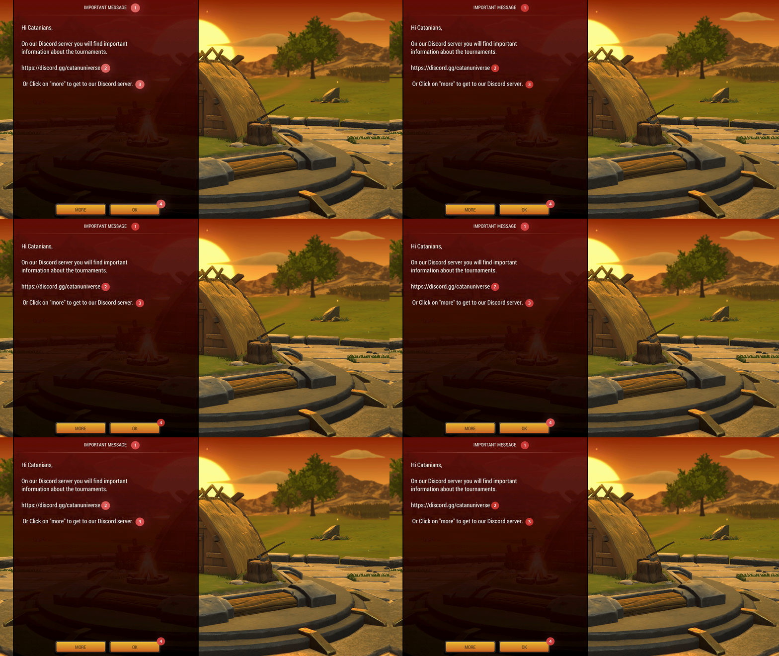
This is the first screen I see when landing on Catan Universe Browser Game.
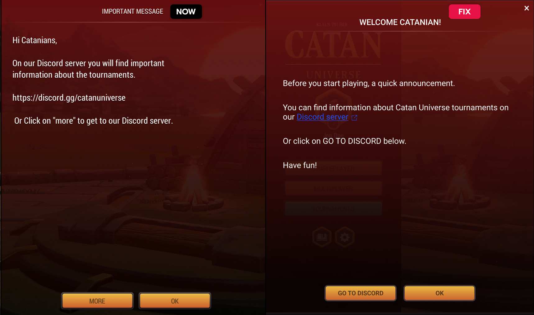
SOLUTION
UX ISSUE
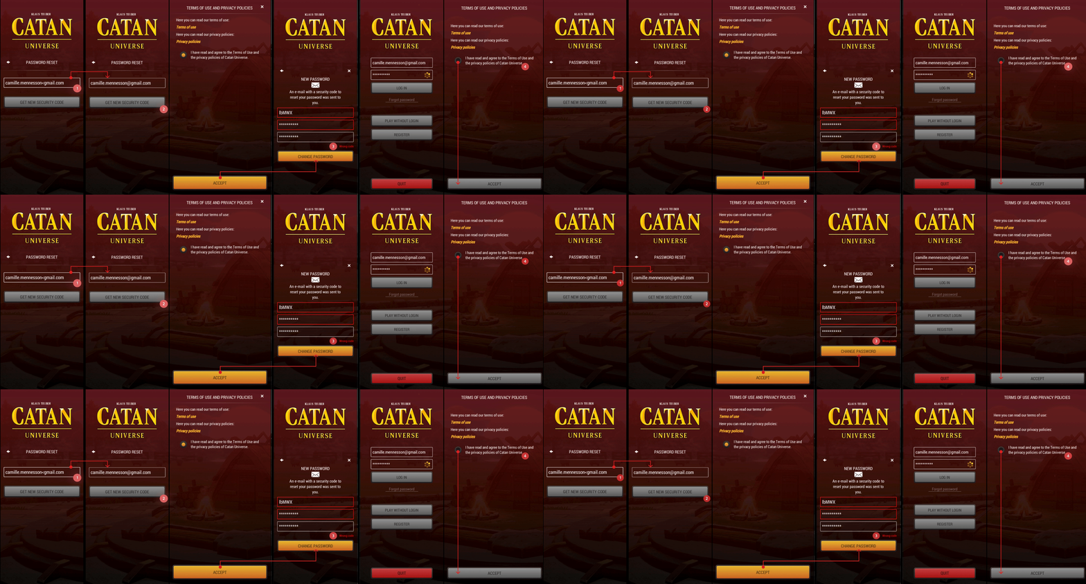
2. Log-in and Password Reset
Stepping-in the bigger issues here, it took me around 4 minutes to reset my password and log-in (no, this is not normal).
UX ISSUE
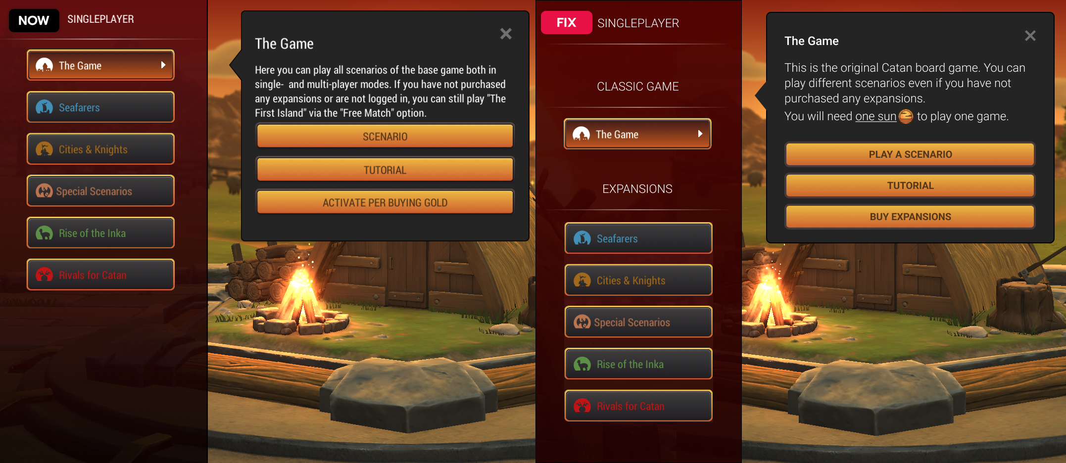
3. Unintuitive Game Creation
Some critical information to understand how to create a game and play are missing and/or are badly delivered.

SOLUTION
USABILITY ISSUE
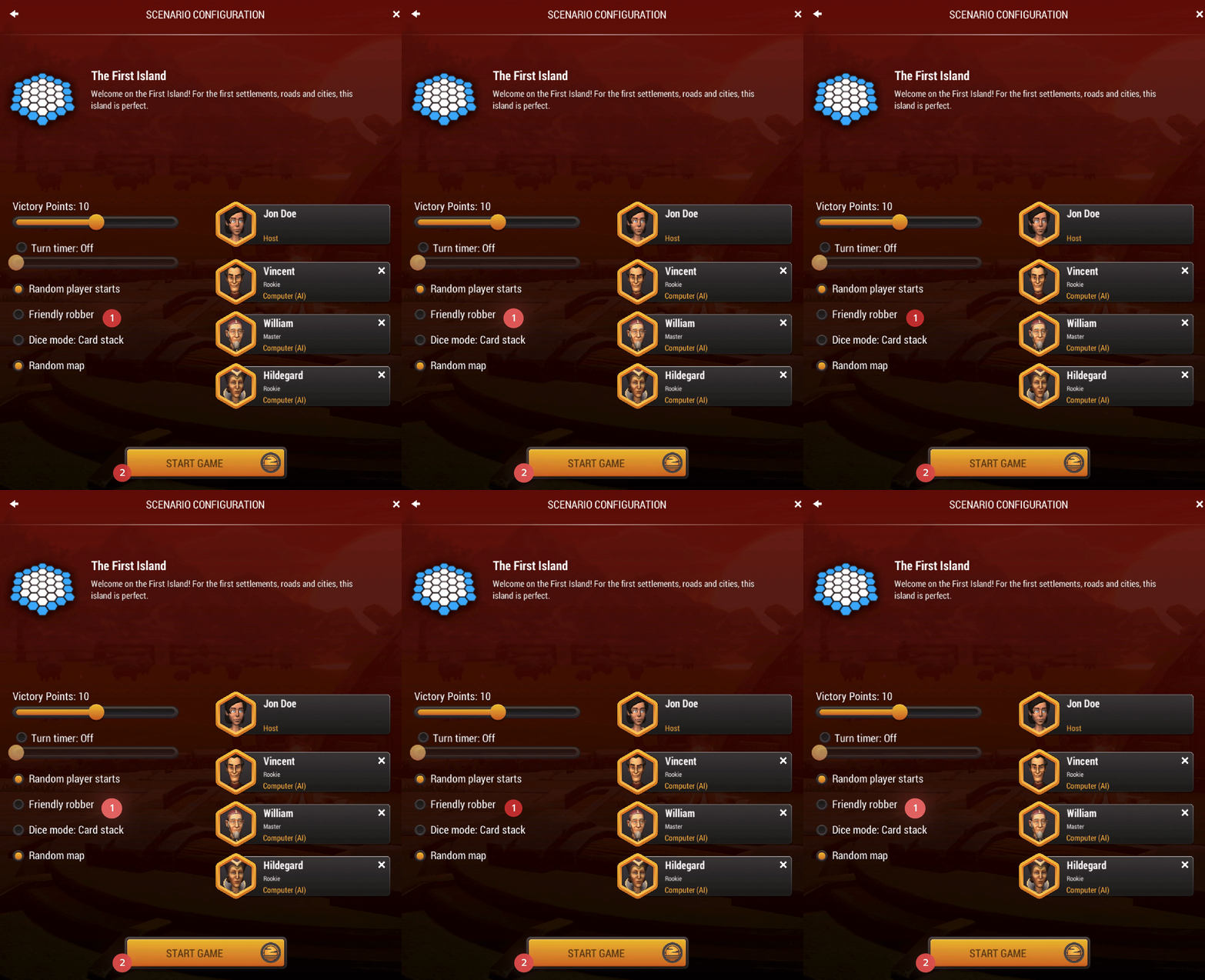
- Use of radio buttons instead of checkboxes. when there are in fact a list of options where I can select any number of choices (Consistency & Standards).
- The “Start game” button has a sun icon associated to it underlying I can’t play without those. This should be explained somwhere before so there’s no bad surprises.
UI ISSUE
4. A very crowded HUD
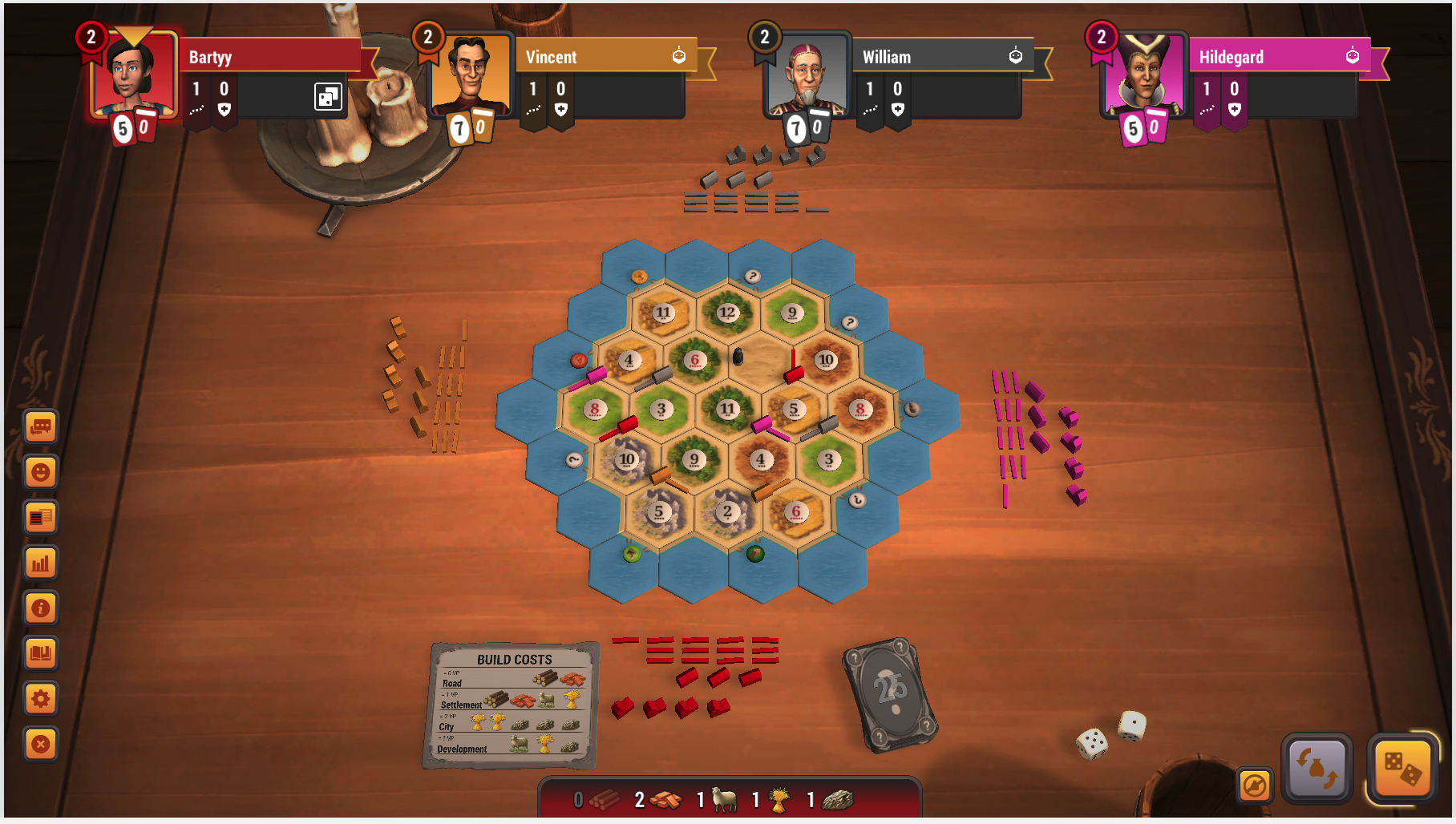
The overall game interface just feels very busy. For a strategic game like Catan, I really just need the relevant information so I can focus on my next move (Aesthetics & Minimalist).
-
Unnecessary UI elements.
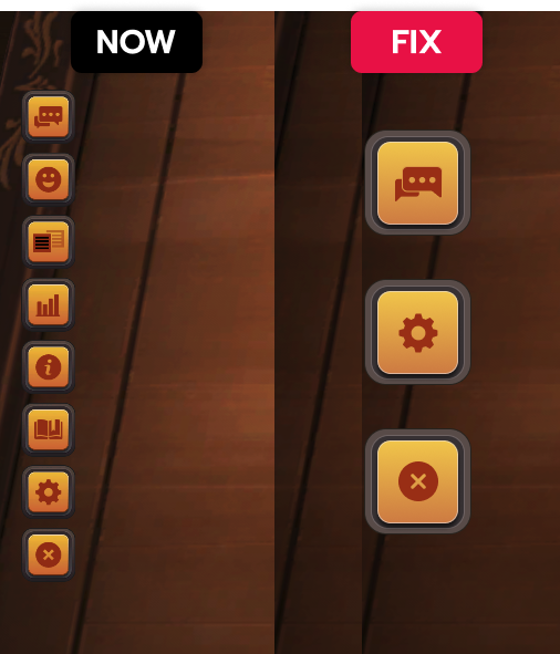
I’m not sure this huge vertical menu on the bottom left is for. Here are 8 small icons that are not necessary (maybe keep the main settings and the chat?)
All the other elements can be hidden into the settings icon and shown when clicked if necessary.
- Missing what’s happening during another player’s turn. The visual hints to understand what is currently happening are too small and going too fast (the bottom left white text, cards animations, yellow highlight on player’s picture) (Visibility of System Status)
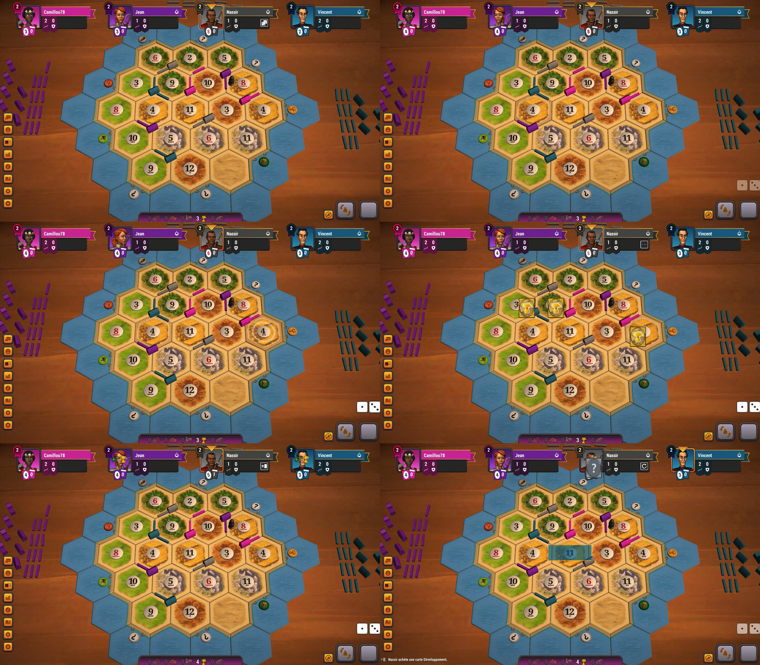
An example of how quickly a turn goes.
- It’s hard to see who is winning. I can’t easily distinguish key information from each player: number of points, development cards, biggest army, and longest road. This is an issue since it’s critical information for this type of strategic game.
- I don’t know which and how many cards I have in my hand. This is a key information that I need to have in mind at all times (when it’s my turn or when exchanging with other players). Considering the size of the board, the number of other visual information and the pace of the game, it’s hardly impossible to quickly scan what types of cards I have in hand.
SOLUTION
- Going back to the previous design would be a good start: full cards easily recognizable.

- Dice button in the wrong place. The most frustrating miss-click in my life… the dice roll and skip your turn buttons are at the exact same position and if you’re acting too fast and misscliked, you lose your turn.
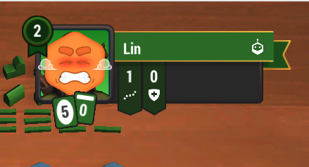
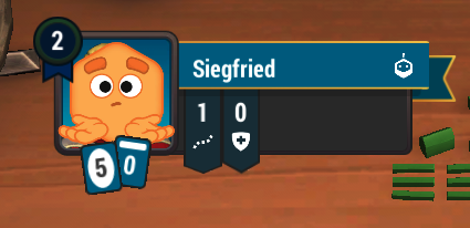
- Emojis to replace human interactions. The only exchange I can have with my fellow AI co-players are emojis displaying expressions that range from happy, confused, angry, cocky, or sarcastic (from what I interpreted). The worst is “impatient” emojis from other players when It’s my turn and I usually need to think in calm on what will be mly next moves.
Final thoughts
Even though I am not a fan of the new design, I still play a lot online with friends because I love this game - it might not be the same experience for new players who are discovering it now.
